
欢迎关注笔者的微信公众号

Plotly 是一个 Python 库,用于设计图形,尤其是交互式图形。它可以绘制各种图形和图表,如直方图、条形图、箱线图、展开图等等。它主要用于数据分析以及财务分析。
plotly 是一个交互式可视化库。
1. plotly安装
pip install plotly
# 或
conda install -c plotly plotly=5.4.0
1.1. 安装jupyter lab支持
pip install "jupyterlab>=3" "ipywidgets>=7.6"
# 或
conda install "jupyterlab>=3" "ipywidgets>=7.6"
jupyter labextension install jupyterlab-plotly@5.4.0 @jupyter-widgets/jupyterlab-manager
1.2. 安装jupyter支持
pip install "notebook>=5.3" "ipywidgets>=7.5"
# 或
conda install "notebook>=5.3" "ipywidgets>=7.5"
2. Plotly 生态
Plotly 是绘图基础库,它可以深度定制调整绘图,但是 API 复杂学习成本较高。 Plotly_exprress 则是对 Plotly 的高级封装,上手容易,它对 Plotly 的常用绘图函数进行了封装。缺点是没有 plotly 那样自由度高,个人感觉类似 Seaborn 和 Matplotlib 的关系。本文不以express为主。 Dash 用于创建交互式绘图工具,可以方便地用它来探索数据,其绘图基于 Plotly。使用 Dash 需要注册并购买套餐,也就是常说的“在线模式”,一般,我们在 Jupyter 内本地绘图就够用了,这是“离线模式”。
3. 画图案例
在画图之前需要先创建画布go.Figure,可以在构造参数中通过data参数指定相关图形也可以后续通过add_trace方法添加
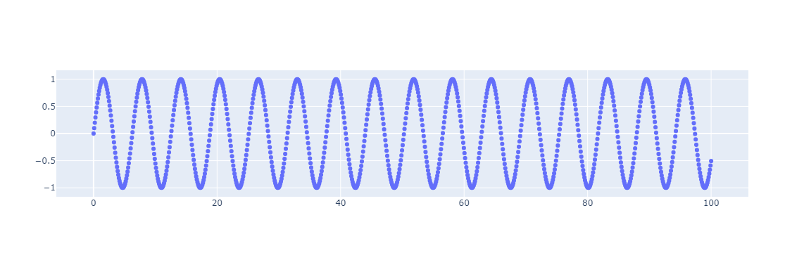
3.1. 散点图
import numpy as np
import plotly.graph_objects as go

x = np.linspace(0, 100, 1000)
y = np.sin(x)

x1 = np.arange(1, 100)
y1 = np.random.random(100)
# 创建画布,在构造函数中通过data参数指定图形
fig = go.Figure(data=go.Scatter(x=x, y=y, mode="markers", name="sign"))
# fig.add_trace(go.Scatter(x=x1, y=y1, name='random'))
# 显示图像
fig.show()
3.2. 折线图
# 创建画布
fig = go.Figure()
# 添加图层
fig.add_trace(go.Scatter(x=x1, y=y1, name="折线图"))
fig.show()

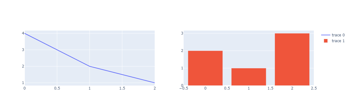
3.3. 添加子图
plotly.subplots.make_subplots() 函数生成一个图形对象图形,该图形对象图形预先配置了可以添加跟踪的子图网格。 add_trace() 函数将在下面详细讨论。
from plotly.subplots import make_subplots

fig = make_subplots(rows=1, cols=2)

fig.add_trace(go.Scatter(y=[4, 2, 1], mode="lines"), row=1, col=1)
fig.add_trace(go.Bar(y=[2, 1, 3]), row=1, col=2)

fig.show()
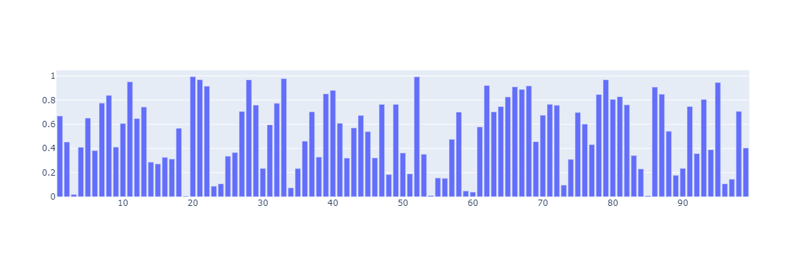
3.4. 添加跟踪(图层)
可以使用 add_trace() 方法将新跟踪添加到图形对象图形中。此方法接受图形对象跟踪(go.Scatter、go.Bar 等的实例)并将其添加到图形中。这允许您从一个空图形开始,并按顺序向其中添加跟踪。 append_trace() 方法做同样的事情,虽然它不返回数字。
# 创建画布(空图层)
fig = go.Figure()

fig.add_trace(go.Bar(x=x1, y=y1))

fig.show()
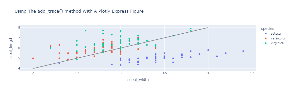
import plotly.express as px

df = px.data.iris()

fig = px.scatter(
    df,
    x="sepal_width",
    y="sepal_length",
    color="species",
    title="Using The add_trace() method With A Plotly Express Figure",
)

fig.add_trace(
    go.Scatter(
        x=[2, 4],
        y=[4, 8],
        mode="lines",
        line=go.scatter.Line(color="gray"),
        showlegend=False,
    )
)
fig.show()
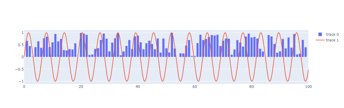
多次调用add_trace可添加多个图层
fig = go.Figure()

fig.add_trace(go.Bar(x=x1, y=y1))
fig.add_trace(go.Scatter(x=x, y=y))

fig.show()
3.5. 向子图添加Trace(图层)
向子图添加跟踪 如果图形是使用 plotly.subplots.make_subplots() 创建的,则向 add_trace() 提供 row 和 col 参数可用于向特定子图添加跟踪。
from plotly.subplots import make_subplots

fig = make_subplots(rows=1, cols=2)

fig.add_trace(go.Scatter(y=[4, 2, 1], mode="lines"), row=1, col=1)
fig.add_trace(go.Bar(y=[2, 1, 3]), row=1, col=2)

fig.show()

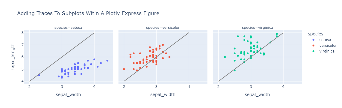
这也适用于 Plotly Express 使用 facet_row 和或 facet_col 参数创建的图形。
import plotly.express as px

df = px.data.iris()

fig = px.scatter(
    df,
    x="sepal_width",
    y="sepal_length",
    color="species",
    facet_col="species",
    title="Adding Traces To Subplots Witin A Plotly Express Figure",
)

reference_line = go.Scatter(
    x=[2, 4],
    y=[4, 8],
    mode="lines",
    line=go.scatter.Line(color="gray"),
    showlegend=False,
)

fig.add_trace(reference_line, row=1, col=1)
fig.add_trace(reference_line, row=1, col=2)
fig.add_trace(reference_line, row=1, col=3)

fig.show()
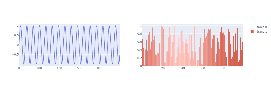
3.6. 添加图层简便方法
作为 add_trace() 方法的替代方法,图形对象图形具有一系列形式为 add_{trace}(其中 {trace} 是跟踪类型的名称)的方法,用于构建和添加每种跟踪类型的跟踪。 这是前面的子图示例,适用于使用 fig.add_scatter() 添加散点跟踪并使用 fig.add_bar() 添加条形跟踪。
from plotly.subplots import make_subplots

fig = make_subplots(rows=1, cols=2)

fig.add_scatter(y=y, mode="lines", row=1, col=1)
fig.add_bar(y=y1, row=1, col=2)

fig.show()
3.7. 魔术下划线符号
为了更轻松地使用嵌套属性,图形对象构造函数和许多图形对象方法支持魔术下划线表示法。
这允许您通过将多个嵌套属性名称与下划线连接在一起来引用嵌套属性。
例如,在没有魔术下划线符号的图形构造函数中指定图形标题需要将布局参数设置为 dict(title=dict(text="A Chart"))。 同样,设置散点轨迹的线条颜色需要将标记属性设置为 dict(color="crimson")。
import plotly.graph_objects as go

fig = go.Figure(
    data=[go.Scatter(y=[1, 3, 2], line=dict(color="crimson"))],
    layout=dict(
        title=dict(text="A Graph Objects Figure Without Magic Underscore Notation")
    ),
)

fig.show()

使用魔术下划线表示法,您可以通过向图形构造函数传递名为 layout_title_text 的关键字参数,并通过向 go.Scatter 构造函数传递名为 line_color 的关键字参数来完成相同的事情。
import plotly.graph_objects as go

fig = go.Figure(
    data=[go.Scatter(y=[1, 3, 2], line_color="crimson")],
    layout_title_text="A Graph Objects Figure With Magic Underscore Notation",
)

fig.show()
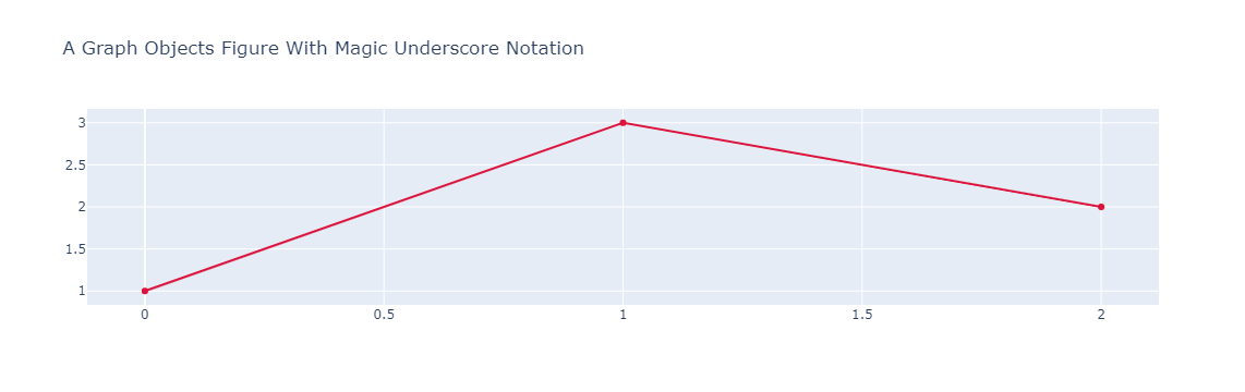
整个图形对象 API 都支持魔术下划线符号,它通常可以显着简化涉及深度嵌套属性的操作。
注意:当您看到传递给图形对象构造函数或方法的带下划线的关键字参数时,几乎总是可以安全地假设它是魔术下划线符号的应用。我们不得不说“几乎总是”而不是“总是”,因为 plotly 模式中有一些属性名称包含下划线:error_x、error_y、error_z、copy_xstyle、copy_ystyle、copy_zstyle、paper_bgcolor 和 plot_bgcolor。这些是在图书馆的早期(2012-2013)添加回来的,然后我们标准化了禁止属性名称中的下划线。
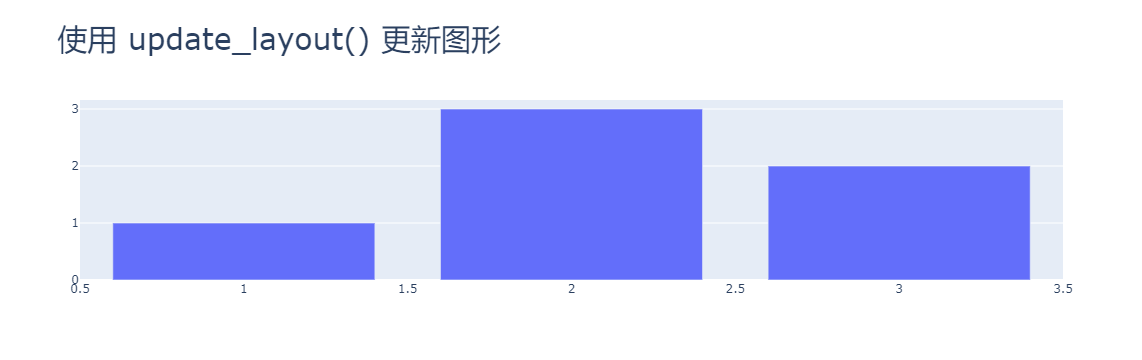
3.8. 更新图形(画布)布局
图形对象图形支持 update_layout() 方法,该方法可用于更新图形布局的多个嵌套属性。 这是使用 update_layout() 更新图形标题的文本和字体大小的示例。
import plotly.graph_objects as go
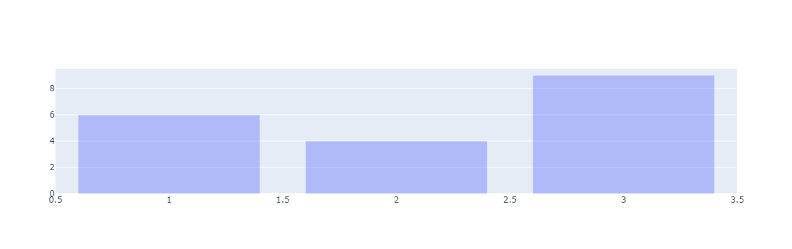
fig = go.Figure(data=go.Bar(x=[1, 2, 3], y=[1, 3, 2]))
fig.update_layout(title_text="使用 update_layout() 更新图形", title_font_size=30)
fig.show()
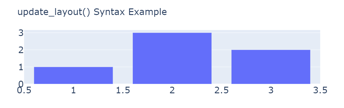
请注意,以下 update_layout() 操作是等效的:
fig.update_layout(title_text="update_layout() Syntax Example", title_font_size=30)
fig.update_layout(title_text="update_layout() Syntax Example", title_font=dict(size=30))
fig.update_layout(title=dict(text="update_layout() Syntax Example"), font=dict(size=30))
fig.update_layout(
    {"title": {"text": "update_layout() Syntax Example", "font": {"size": 30}}}
)
fig.update_layout(
    title=go.layout.Title(
        text="update_layout() Syntax Example", font=go.layout.title.Font(size=30)
    )
)
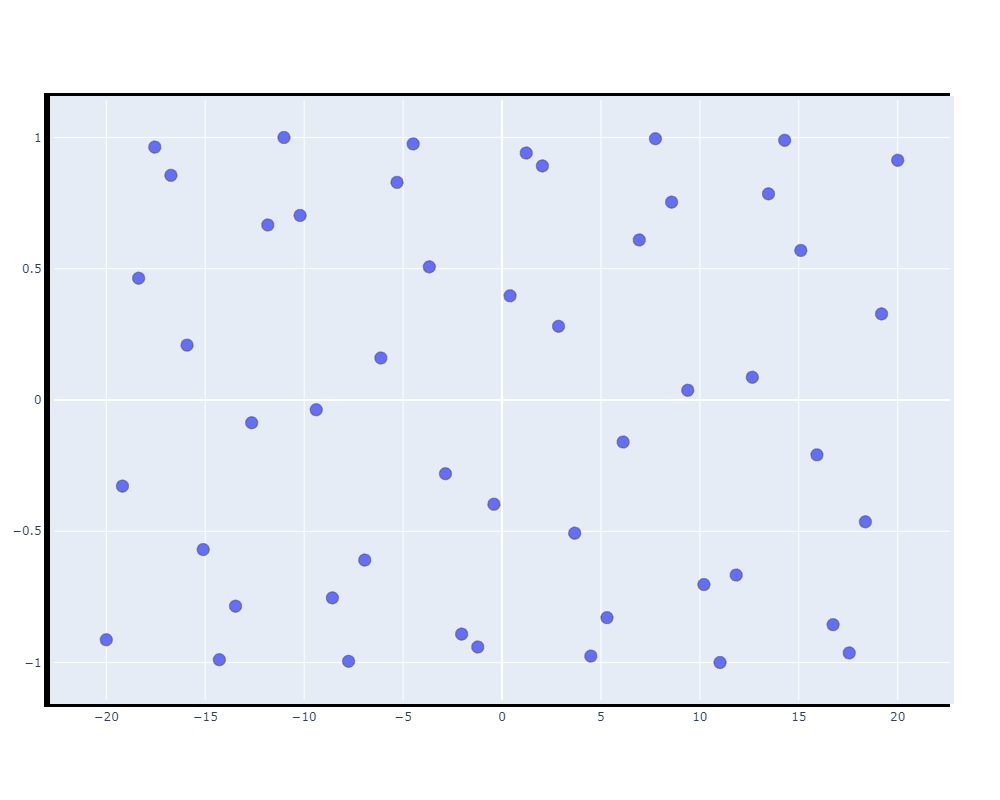
更新图层(trace)大小
import numpy as np
import plotly.graph_objs as go

x = np.linspace(-20, 20)
y = np.sin(x)

trace1 = go.Scatter(
    x=x,  # x-coordinates of trace
    y=y,  # y-coordinates of trace
    mode="markers +text ",  # scatter mode (more in UG section 1)
    opacity=1,
    textposition="top center",
    marker=dict(size=12, line=dict(width=0.5)),
    textfont=dict(
        color="black",
        size=18,  # can change the size of font here
        family="Times New Roman",
    ),
)
data = [trace1]

layout = go.Layout(
    autosize=False,
    width=1000,  # 设置画布宽度
    height=800,  # 设置画布高度
    xaxis=go.layout.XAxis(
        linecolor="black", linewidth=3, mirror=True  # 设置X轴线宽
    ),  # 上下X轴是否一样
    yaxis=go.layout.YAxis(
        linecolor="black", linewidth=6, mirror=False  # 设置Y轴线宽
    ),  # 左右Y轴是否一样
    margin=go.layout.Margin(l=50, r=50, b=100, t=100, pad=4),
)

fig = go.Figure(data=data, layout=layout)
fig.show()
3.9. 批量更新追踪(图层)
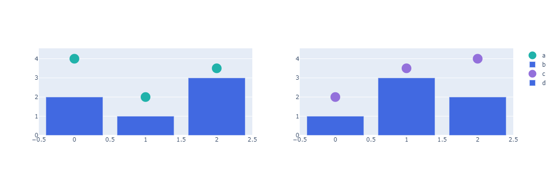
图形对象图形支持 update_traces() 方法,该方法可用于更新图形的一个或多个轨迹的多个嵌套属性。 为了展示一些示例,我们将从一个包含跨越两个子图的条形和散点轨迹的图形开始。
from plotly.subplots import make_subplots

fig = make_subplots(rows=1, cols=2)

fig.add_scatter(
    y=[4, 2, 3.5],
    mode="markers",
    marker=dict(size=20, color="LightSeaGreen"),
    name="a",
    row=1,
    col=1,
)

fig.add_bar(y=[2, 1, 3], marker=dict(color="MediumPurple"), name="b", row=1, col=1)

fig.add_scatter(
    y=[2, 3.5, 4],
    mode="markers",
    marker=dict(size=20, color="MediumPurple"),
    name="c",
    row=1,
    col=2,
)

fig.add_bar(y=[1, 3, 2], marker=dict(color="LightSeaGreen"), name="d", row=1, col=2)

fig.show()
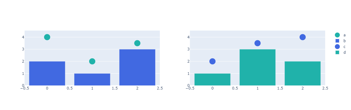
请注意,散点图和条形图都有一个marker.color 属性来控制它们的颜色。以下是使用 update_traces() 修改所有轨迹颜色的示例。
from plotly.subplots import make_subplots

fig = make_subplots(rows=1, cols=2)

fig.add_scatter(
    y=[4, 2, 3.5],
    mode="markers",
    marker=dict(size=20, color="LightSeaGreen"),
    name="a",
    row=1,
    col=1,
)

fig.add_bar(y=[2, 1, 3], marker=dict(color="MediumPurple"), name="b", row=1, col=1)

fig.add_scatter(
    y=[2, 3.5, 4],
    mode="markers",
    marker=dict(size=20, color="MediumPurple"),
    name="c",
    row=1,
    col=2,
)

fig.add_bar(y=[1, 3, 2], marker=dict(color="LightSeaGreen"), name="d", row=1, col=2)

fig.update_traces(marker=dict(color="RoyalBlue"))

fig.show()

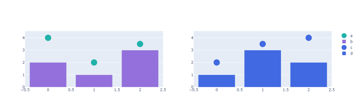
update_traces() 方法支持一个选择器参数来控制应该更新哪些跟踪。只有具有与选择器匹配的属性的跟踪才会更新。这是使用选择器仅更新条形轨迹颜色的示例。
from plotly.subplots import make_subplots

fig = make_subplots(rows=1, cols=2)
fig.add_scatter(
    y=[4, 2, 3.5],
    mode="markers",
    marker=dict(size=20, color="LightSeaGreen"),
    name="a",
    row=1,
    col=1,
)
fig.add_bar(y=[2, 1, 3], marker=dict(color="MediumPurple"), name="b", row=1, col=1)
fig.add_scatter(
    y=[2, 3.5, 4],
    mode="markers",
    marker=dict(size=20, color="MediumPurple"),
    name="c",
    row=1,
    col=2,
)
fig.add_bar(y=[1, 3, 2], marker=dict(color="LightSeaGreen"), name="d", row=1, col=2)
fig.update_traces(marker=dict(color="RoyalBlue"), selector=dict(type="bar"))

fig.show()
可以在选择器中使用魔术下划线符号来匹配嵌套属性。这是一个更新所有正式着色为 "MediumPurple" 的跟踪颜色的示例。
from plotly.subplots import make_subplots

fig = make_subplots(rows=1, cols=2)

fig.add_scatter(
    y=[4, 2, 3.5],
    mode="markers",
    marker=dict(size=20, color="LightSeaGreen"),
    name="a",
    row=1,
    col=1,
)

fig.add_bar(y=[2, 1, 3], marker=dict(color="MediumPurple"), name="b", row=1, col=1)

fig.add_scatter(
    y=[2, 3.5, 4],
    mode="markers",
    marker=dict(size=20, color="MediumPurple"),
    name="c",
    row=1,
    col=2,
)

fig.add_bar(y=[1, 3, 2], marker=dict(color="LightSeaGreen"), name="d", row=1, col=2)

fig.update_traces(marker_color="RoyalBlue", selector=dict(marker_color="MediumPurple"))

fig.show()
对于带有子图的图形,update_traces() 方法还支持 row 和 col 参数来控制应更新哪些跟踪。只会更新指定子图行和列中的轨迹。这是更新第二个子图列中所有轨迹颜色的示例。
from plotly.subplots import make_subplots

fig = make_subplots(rows=1, cols=2)
fig.add_scatter(
    y=[4, 2, 3.5],
    mode="markers",
    marker=dict(size=20, color="LightSeaGreen"),
    name="a",
    row=1,
    col=1,
)
fig.add_bar(y=[2, 1, 3], marker=dict(color="MediumPurple"), name="b", row=1, col=1)
fig.add_scatter(
    y=[2, 3.5, 4],
    mode="markers",
    marker=dict(size=20, color="MediumPurple"),
    name="c",
    row=1,
    col=2,
)
fig.add_bar(y=[1, 3, 2], marker=dict(color="LightSeaGreen"), name="d", row=1, col=2)
fig.update_traces(marker=dict(color="RoyalBlue"), col=2)

fig.show()
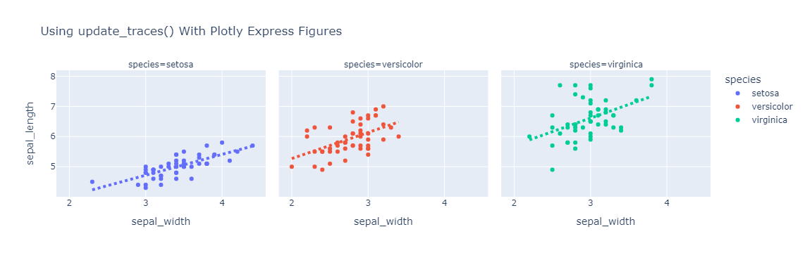
update_traces() 方法也可用于图形工厂或 Plotly Express 生成的图形。这是将 Plotly Express 生成的回归线更新为虚线的示例。
import pandas as pd
import plotly.express as px

df = px.data.iris()
fig = px.scatter(
    df,
    x="sepal_width",
    y="sepal_length",
    color="species",
    facet_col="species",
    trendline="ols",
    title="Using update_traces() With Plotly Express Figures",
)
fig.update_traces(
    line=dict(dash="dot", width=4), selector=dict(type="scatter", mode="lines")
)
fig.show()
4. 使用更新方法时覆盖现有属性
update_layout() 和 update_traces() 有一个 overwrite 关键字参数,默认为 False,在这种情况下,更新将递归应用于现有的嵌套属性结构。设置为 True 时,现有属性的先前值将被提供的值覆盖。
在下面的示例中,在 update_traces() 中使用 overwrite=True 更新标记时,标记的红色会被覆盖。请注意,使用魔术下划线代替marker_opacity设置不会覆盖marker_color,因为属性将仅在marker.opacity 级别开始被覆盖。
import plotly.graph_objects as go

fig = go.Figure(
    go.Bar(x=[1, 2, 3], y=[6, 4, 9], marker_color="red")
)  # will be overwritten below
fig.update_traces(overwrite=True, marker={"opacity": 0.4})
fig.show()
4.1. 有条件地更新跟踪
假设您要对跟踪集合进行的更新取决于某些跟踪属性的当前值。 update_traces() 方法不能处理这种情况,但是 for_each_trace() 方法可以!
作为它的第一个参数,for_each_trace() 方法接受一个函数,该函数一次接受和更新一个跟踪。与 update_traces() 一样,for_each_trace() 也接受选择器、行和列参数来控制应考虑哪些跟踪。
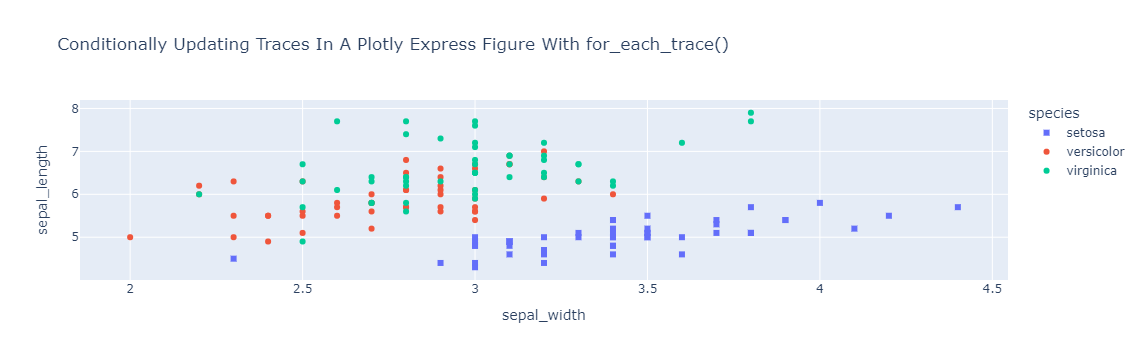
这是使用 for_each_trace() 将“setosa”的唯一标记转换为 Plotly Express 图形中的方形符号的示例。
import pandas as pd
import plotly.express as px

df = px.data.iris()
fig = px.scatter(
    df,
    x="sepal_width",
    y="sepal_length",
    color="species",
    title="Conditionally Updating Traces In A Plotly Express Figure With for_each_trace()",
)
fig.for_each_trace(
    lambda trace: trace.update(marker_symbol="square")
    if trace.name == "setosa"
    else (),
)
fig.show()
4.2. 更新图形轴
图形对象图形支持 update_xaxes() 和 update_yaxes() 方法,这些方法可用于更新图形的一个或多个轴的多个嵌套属性。这是使用 update_xaxes() 禁用 Plotly Express 生成的图中所有子图中的垂直网格线的示例。
import pandas as pd
import plotly.express as px

df = px.data.iris()
fig = px.scatter(
    df,
    x="sepal_width",
    y="sepal_length",
    color="species",
    facet_col="species",
    title="Using update_xaxes() With A Plotly Express Figure",
)
fig.update_xaxes(showgrid=False)
fig.show()

还有类似于上述 for_each_trace() 方法的 for_each_xaxis() 和 for_each_yaxis() 方法。对于非笛卡尔子图类型(例如 polar),还有额外的 update_{type} 和 for_each_{type} 方法(例如 update_polar()、for_each_polar())。
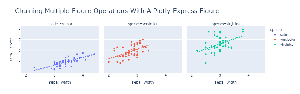
5. 链式表达
上面描述的所有图形更新操作都是返回对正在修改的图形的引用的方法。这使得可以将多个图形修改操作链接到单个表达式中。
import plotly.express as px

df = px.data.iris()
(
    px.scatter(
        df,
        x="sepal_width",
        y="sepal_length",
        color="species",
        facet_col="species",
        trendline="ols",
        title="Chaining Multiple Figure Operations With A Plotly Express Figure",
    )
    .update_layout(title_font_size=24)
    .update_xaxes(showgrid=False)
    .update_traces(
        line=dict(dash="dot", width=4), selector=dict(type="scatter", mode="lines")
    )
).show()
6. 属性分配
可以使用属性分配语法更新跟踪和布局属性。这是使用属性分配设置图形标题的示例。
6.1. 修改图形样式,颜色
import plotly.graph_objects as go

fig = go.Figure(data=go.Bar(x=[1, 2, 3], y=[1, 3, 2]))
fig.layout.title.text = "Using Property Assignment Syntax With A Graph Object Figure"
fig.show()

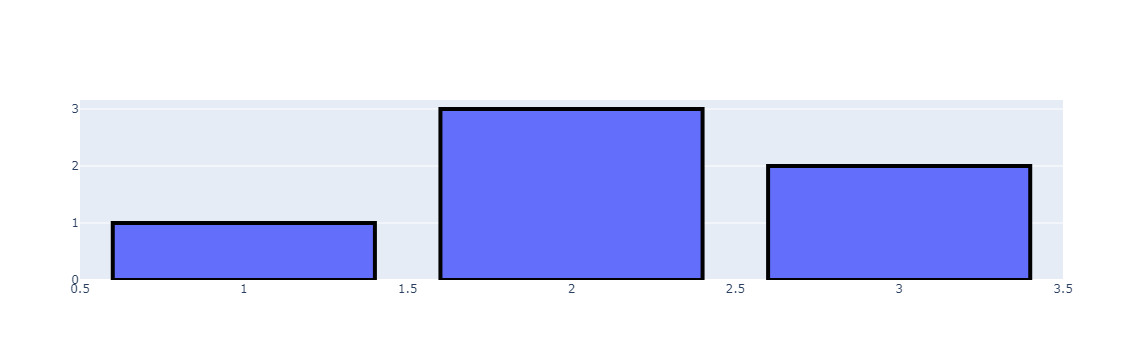
这是使用属性分配更新条形轮廓的示例。
import plotly.graph_objects as go

fig = go.Figure(data=go.Bar(x=[1, 2, 3], y=[1, 3, 2]))
fig.data[0].marker.line.width = 4
fig.data[0].marker.line.color = "black"

fig.show()
That’s all!